Blog
Fresh takes on fast analytics
Learn how to turn spreadsheets into dashboards. Get tips on using AI to find insights. Read product updates and guides.
Welcome to the VizMint blog, your resource for data analytics insights, dashboard design tips, and AI-powered analytics best practices. Whether you're a small business owner looking to understand your sales data, a marketer tracking campaign performance, or a data analyst seeking faster ways to visualize insights, our blog covers practical strategies and real-world examples.
Explore tutorials on Excel dashboard creation, learn how AI can automate your reporting workflow, discover data visualization techniques, and stay updated on VizMint product features. Our articles are written to help you transform raw data into actionable insights that drive better business decisions.
Latest Posts
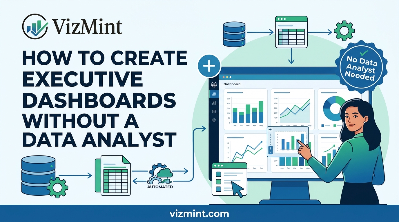
How to Create Executive Dashboards Without a Data Analyst
Executive dashboards help leaders understand business performance quickly, but many teams do not have a dedicated data analyst to build them. Learn how to create executive dashboards from Excel or CSV data using KPI cards, charts, summaries, and AI-powered insights without complex BI setup.
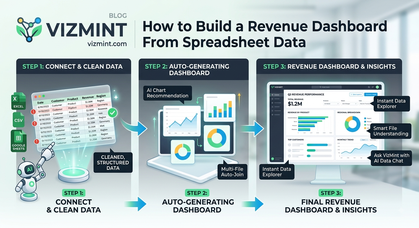
How to Build a Revenue Dashboard From Spreadsheet Data
Revenue data often starts in spreadsheets, but raw Excel or CSV files do not clearly show what is driving business growth. Learn how to build a revenue dashboard from spreadsheet data, track key sales metrics, visualize trends, compare performance, and turn revenue numbers into clear business insights.
How to Analyze Marketing Campaign Data From CSV Files
Marketing campaign data often comes from CSV exports, but raw rows and columns do not always show what is working. Learn how to analyze marketing campaign data from CSV files, track key metrics, find performance trends, create dashboards, and turn campaign data into clear insights faster.
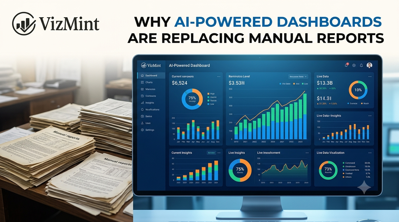
Why AI-Powered Dashboards Are Replacing Manual Reports
Manual reports take time, break easily, and often become outdated before teams can act on them. Learn why AI-powered dashboards are replacing manual reports by turning Excel and CSV data into clear charts, KPI cards, summaries, and business insights faster.
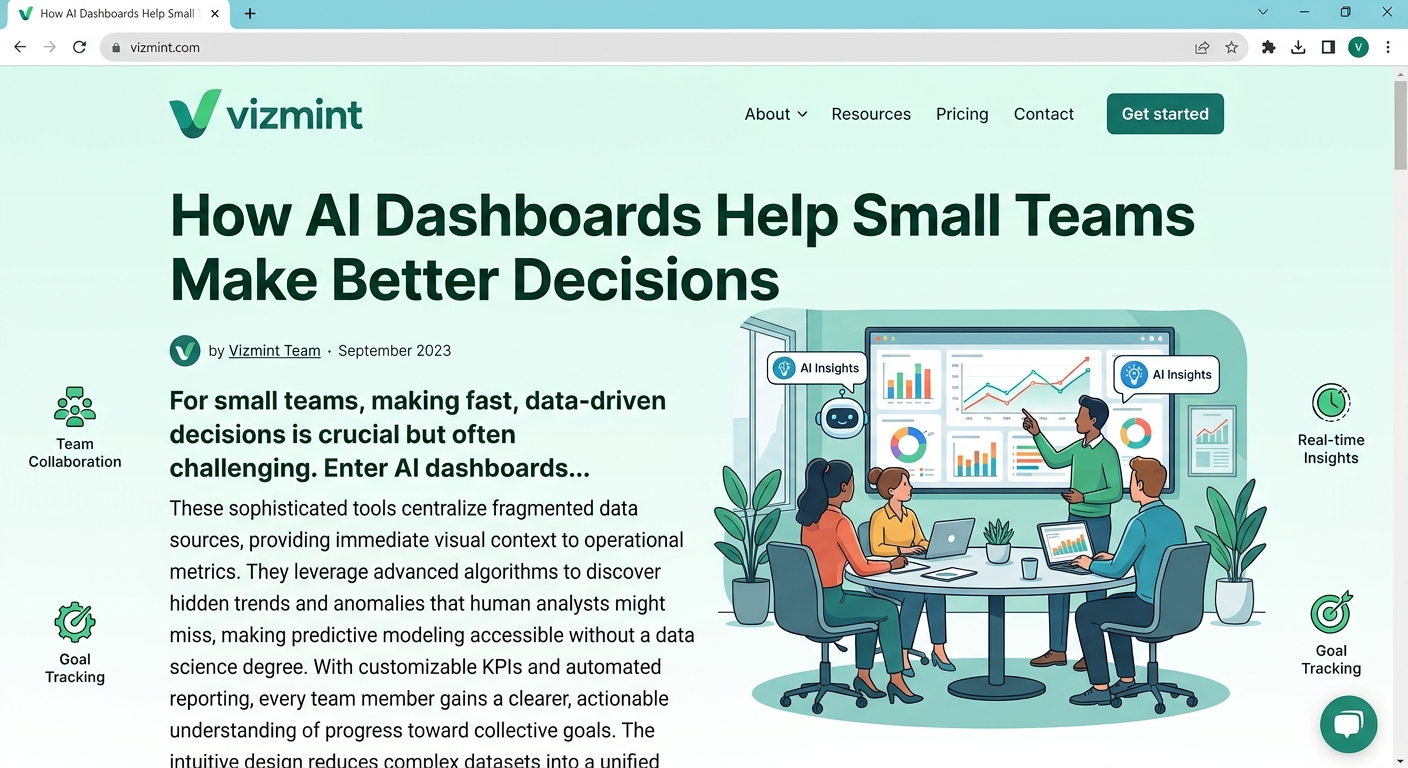
How AI Dashboards Help Small Teams Make Better Decisions
Small teams need fast, clear, and reliable business insights, but manual spreadsheet reporting often slows them down. This guide explains how AI dashboards help small teams turn Excel and CSV data into visual reports, KPI tracking, plain-language insights, and better decisions without complex BI setup.
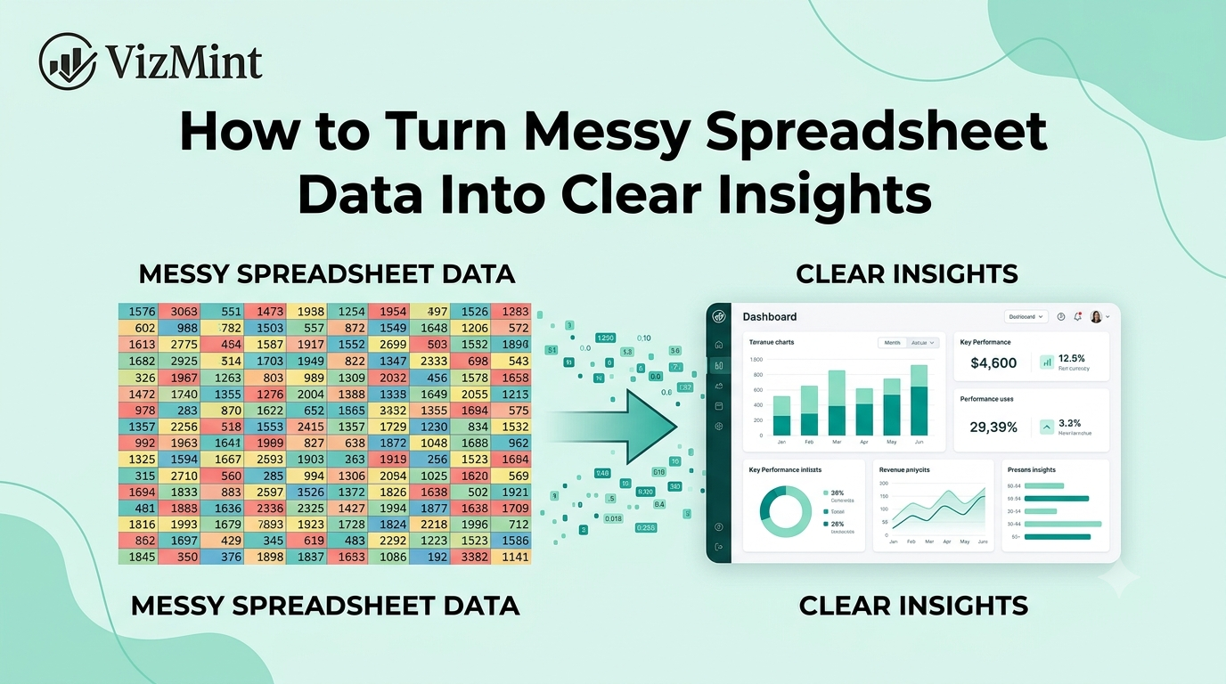
How to Turn Messy Spreadsheet Data Into Clear Insights
Messy spreadsheet data can hide important business insights behind duplicate rows, unclear columns, inconsistent formats, and confusing numbers. This guide explains how to turn messy Excel or CSV data into clear insights using better data structure, dashboards, visual reports, and AI-powered analysis.
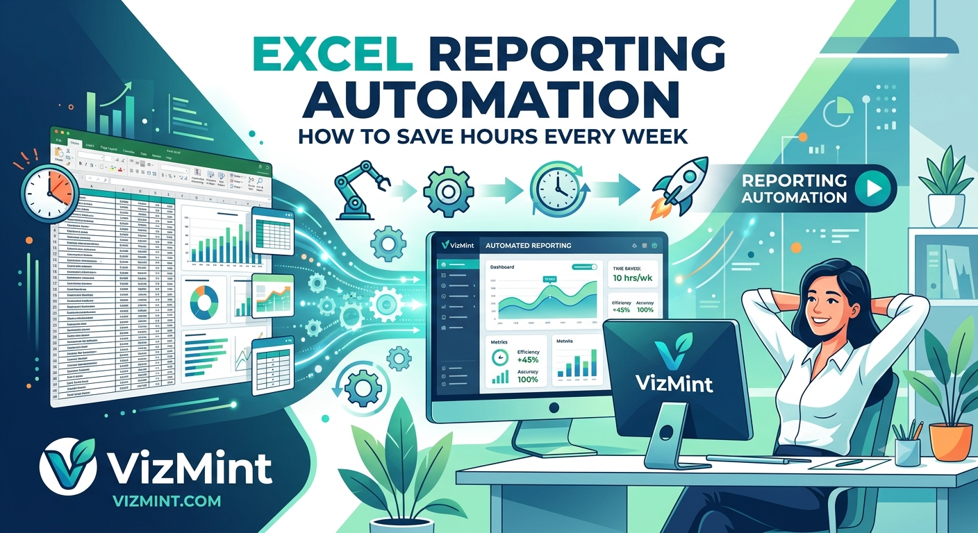
Excel Reporting Automation: How to Save Hours Every Week
Excel reporting automation helps teams save hours every week by reducing manual spreadsheet work, repetitive chart creation, formula updates, and report formatting. This guide explains how businesses can automate Excel reporting with dashboards, AI-powered insights, and faster reporting workflows.
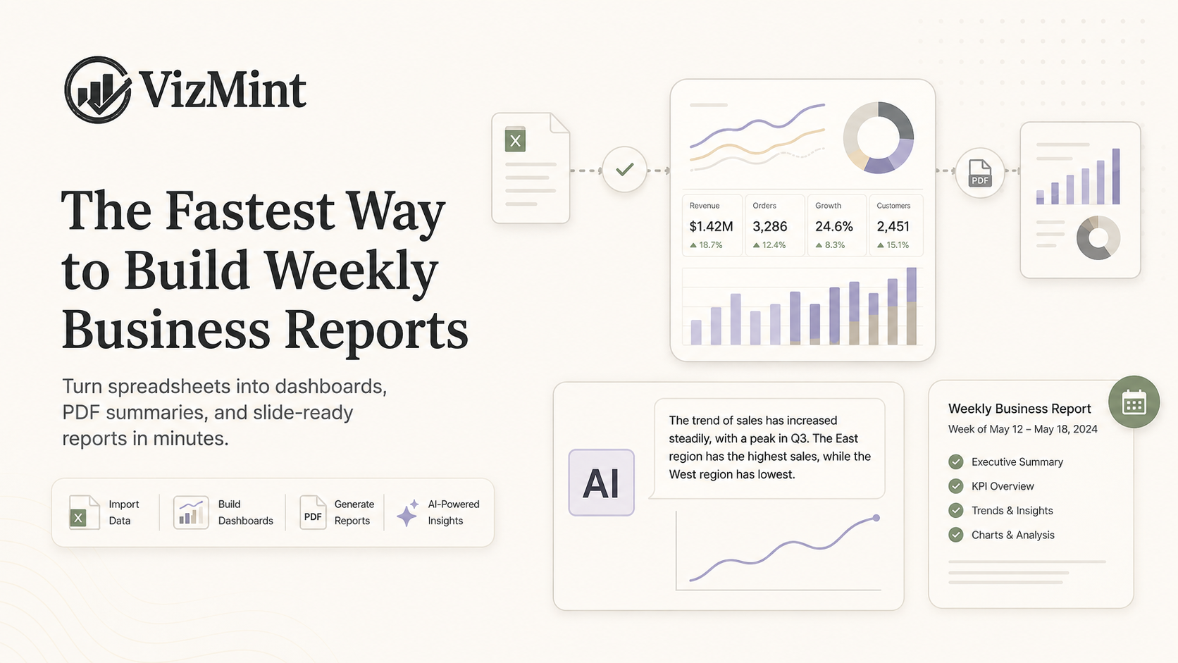
The Fastest Way to Build Weekly Business Reports
Weekly business reports help teams understand performance, spot problems, and make better decisions. But creating them manually from spreadsheets can take hours every week. This guide explains the fastest way to build weekly business reports using Excel files, CSV data, dashboards, and AI-powered reporting tools.
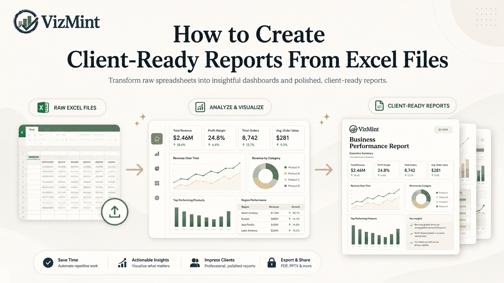
How to Create Client-Ready Reports From Excel Files
Learn how to turn Excel files into professional client-ready reports with clean charts, KPI summaries, dashboards, and AI-powered insights. This guide explains how agencies, consultants, marketers, analysts, and business teams can move from raw spreadsheet data to polished reports faster without spending hours on manual formatting.
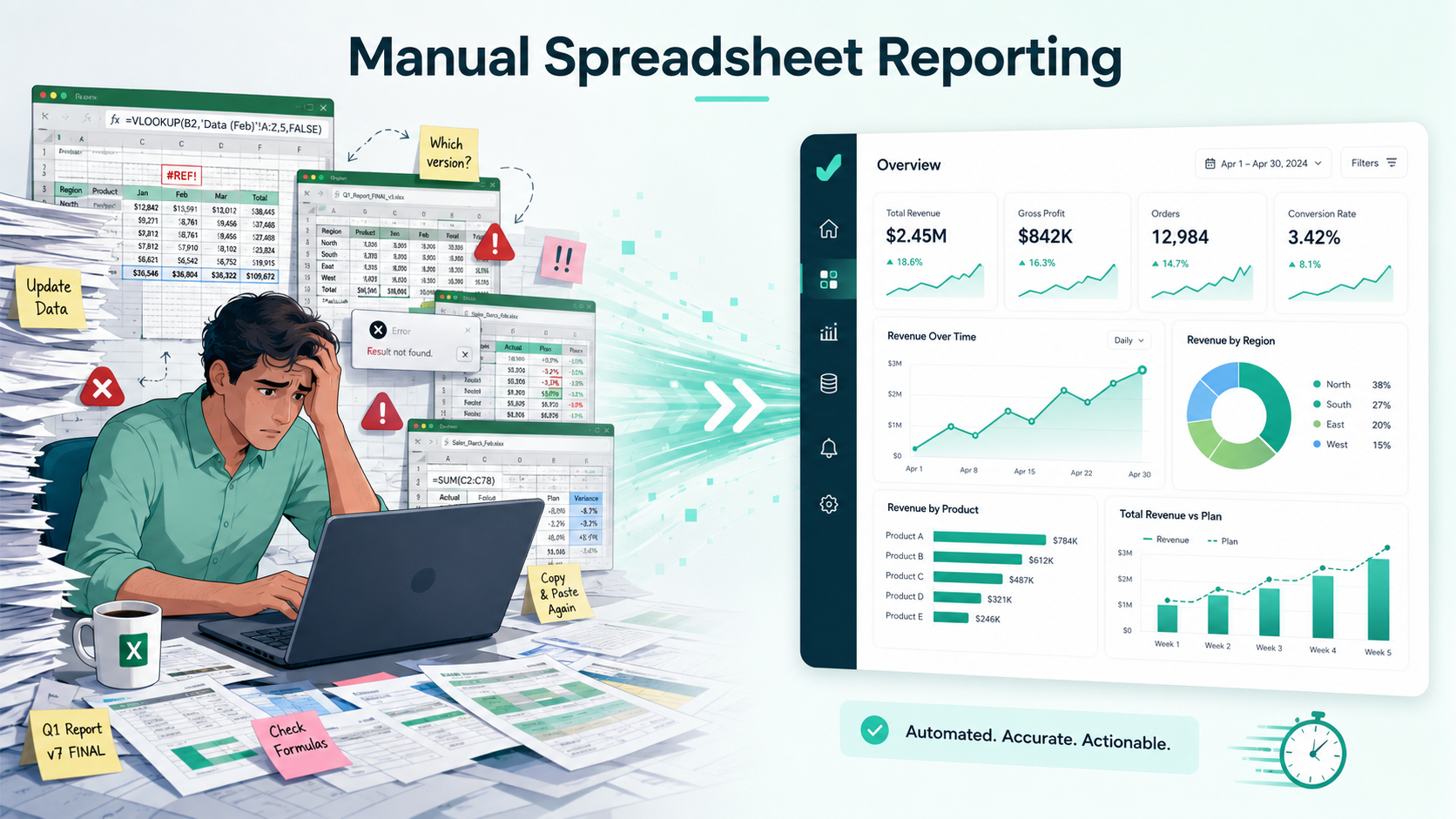
Why Manual Spreadsheet Reporting Is Slowing Your Business Down
Manual spreadsheet reporting may feel familiar, but it often wastes hours, creates errors, delays decisions, and makes business data harder to understand. Learn why manual Excel and CSV reporting slows teams down and how AI-powered dashboards help businesses move from raw data to insights faster.
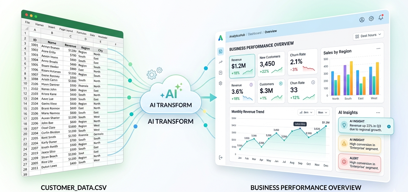
How to Turn Excel and CSV Data Into an Interactive Dashboard Without Power BI
Learn how to convert Excel and CSV data into an interactive dashboard without formulas, manual chart setup, or complex BI tools. This guide explains the fastest way to move from raw spreadsheet data to clear business insights using AI-powered dashboard generation.
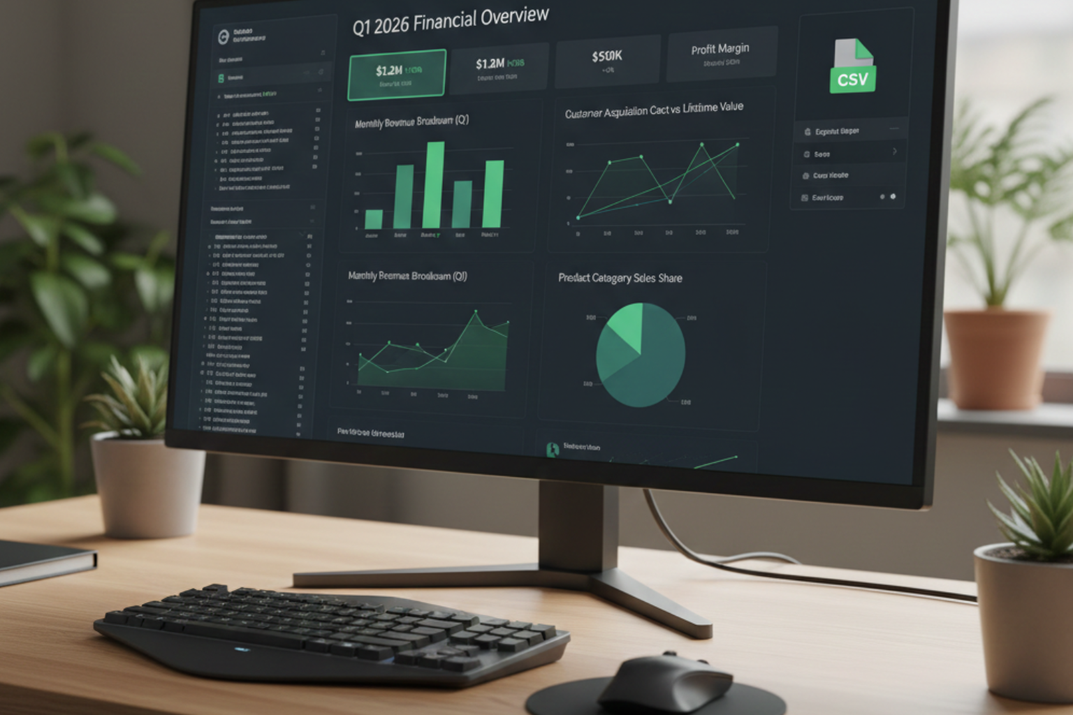
CSV Data Visualization: Turn Raw CSV Files Into Clear Charts and Insights
CSV data visualization helps you turn messy comma-separated data into clear charts and insights. Learn how to import, clean, sort, and visualize CSV datasets fast.
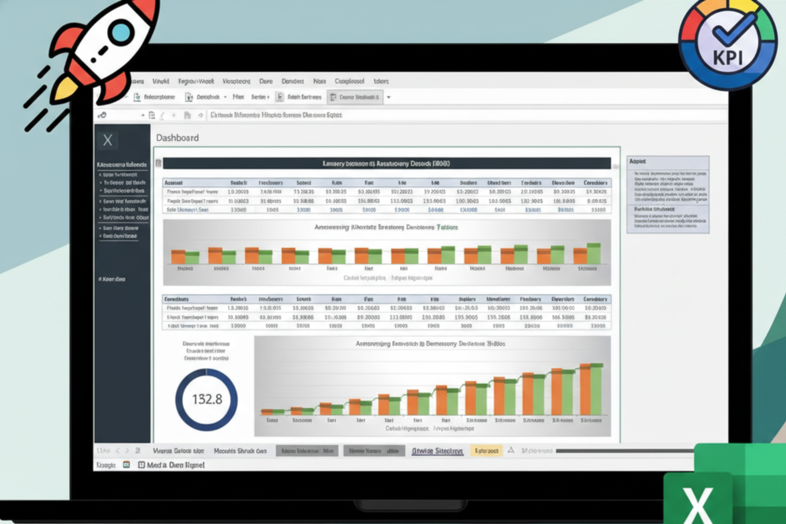
Startup KPI Dashboard: Keep Your Team Aligned and Metrics Visible
A startup KPI dashboard brings your goals, progress, and tasks into one place. Track performance, align teams, and make decisions faster with clear metrics.

Sales Analytics Powered by AI: Turn Raw Revenue Data Into Clear Insights
Sales analytics powered by AI helps you convert raw payment data into clear revenue insights. Analyze totals, fees, discounts, and net sales automatically.

Supply and Demand Graph Maker AI: Visualize Market Forces Instantly
Struggling with supply and demand graphs? Learn how AI instantly creates accurate supply and demand curves, equilibrium points, and market shifts from your data.
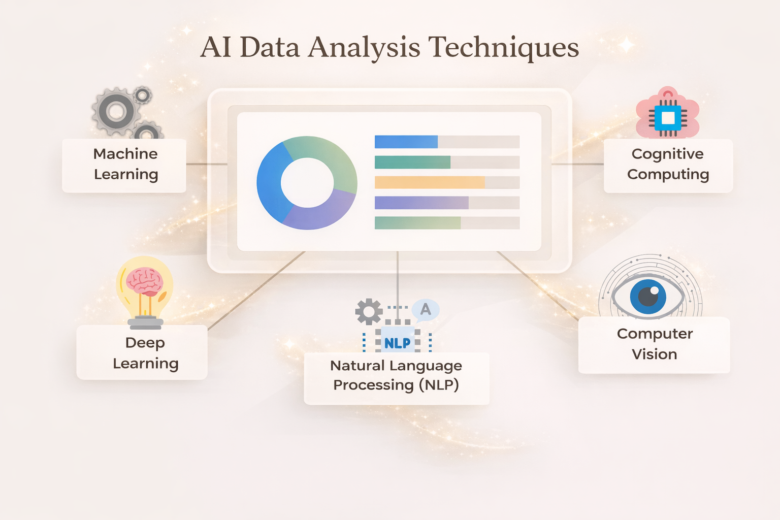
Instant Dashboards From Spreadsheet Data: Turn Excel Into Insights Automatically
Turn long Excel spreadsheets into interactive dashboards automatically. Learn how to use tables, pivot charts, and slicers to uncover insights instantly.
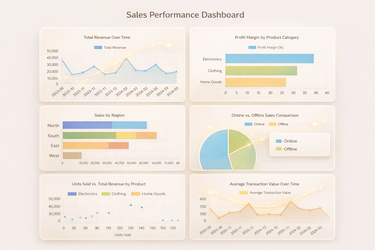
Graph Maker AI: Create Accurate Graphs From Your Data Instantly
Turn raw data into accurate graphs instantly using AI. Create bar charts, pie charts, scatter plots, and line graphs with a single prompt-no manual setup required.
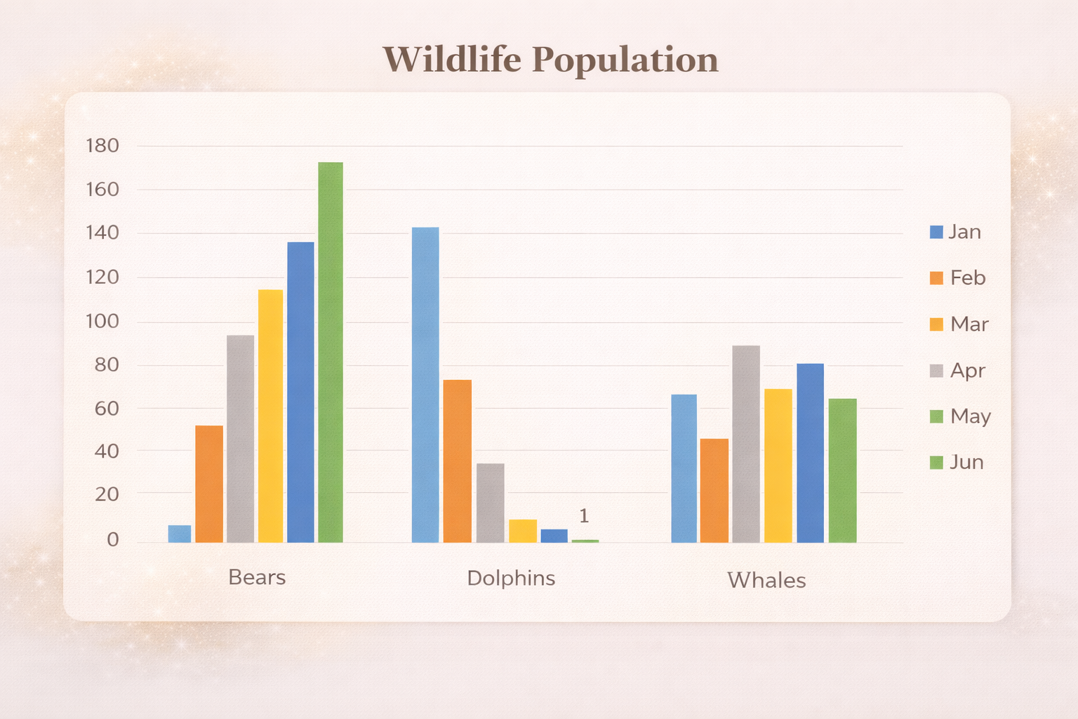
How to Create a Graph From Excel Data
Learn how to create graphs from Excel data step by step. Discover chart types, shortcuts, formatting tips, and how to turn raw data into clear visuals.

Organizational Chart Maker AI: Build Clear Team Structures Instantly
Create clear, professional org charts instantly using AI. Upload your team data, customize styles, add photos, and export org charts in minutes-no manual design needed.

Charts Maker AI: Create Smart Charts From Your Data Instantly
Turn raw data into beautiful charts using AI. With Charts Maker AI, create bar charts, pie charts, scatter plots, and more instantly using simple prompts.
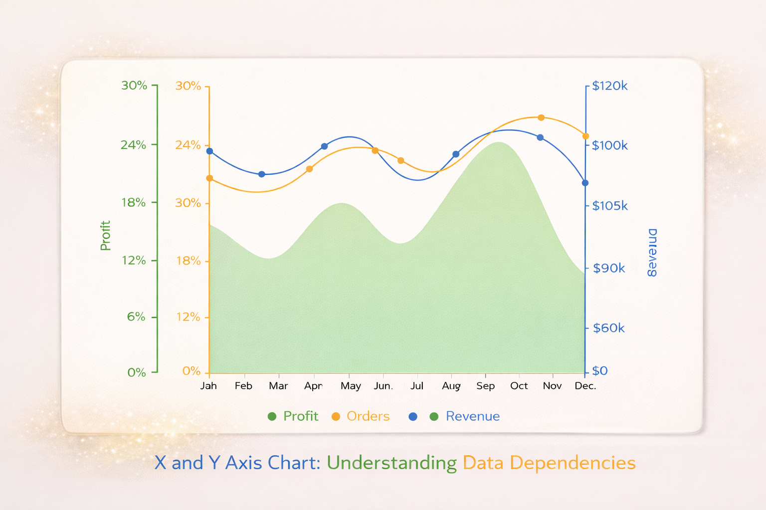
Excel Not Graphing Data Correctly? Here’s the Real Reason
Is Excel not showing all your data in charts? Missing products, years, or values usually aren’t bugs. Learn the real reasons Excel charts break and how to fix them fast.
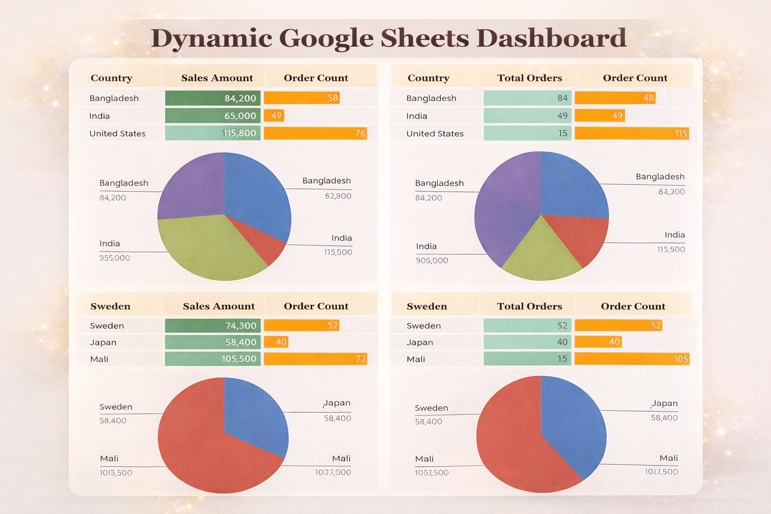
Create Dynamic Pivot Charts from Pivot Tables
Learn how to create dynamic pivot charts from pivot tables in Excel. Build interactive, filterable charts using slicers - no formulas required.
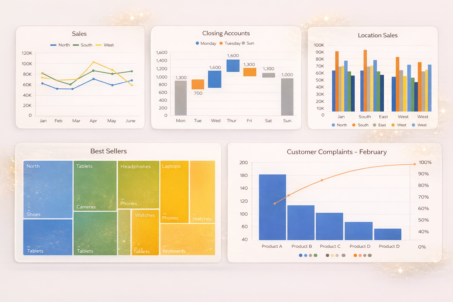
Turn Excel Data Into a Graph
Learn how to turn Excel data into a graph using bar charts, column charts, multi-column charts, and stacked columns. Simple steps, clear examples, and quick tips.

How to Create Instant Dashboards from Spreadsheets
Learn how to transform your Excel and CSV files into beautiful, interactive dashboards in minutes with VizMint's AI-powered platform.